
Branding1 min read
Three new brand identities: Asal Perfume, AfroArt and True-Life Polyclinic
A perfume boutique, a coffee shop and bakery, and a healthcare clinic. Three very different businesses, three identities built around the people they serve.
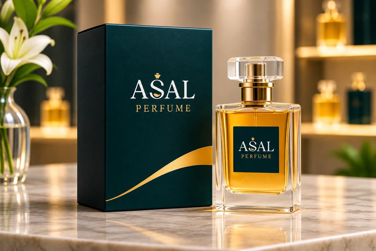
Our branding team has recently completed identity work for three businesses in very different sectors. Each project started the same way: understanding the business, its customers, and how it wants to be seen. The results look nothing alike, and that is the point.
Asal Perfume: quiet luxury in teal and gold
Asal Perfume wanted a brand that feels premium from the street sign to the gift box. We paired a refined wordmark with a single gold accent on a deep teal base, then carried it across the storefront, boutique signage, packaging, gift sets, shopping bags, and staff uniforms.
AfroArt Coffee and Bakery: warm and welcoming
For AfroArt, the brief was warmth. The logo brings together a coffee cup, coffee beans, and fresh bread in rich browns and orange. We applied it to cups, pastry boxes, paper and delivery bags, the menu, loyalty cards, signage, and staff aprons and polos.
True-Life Polyclinic: clear and trustworthy
In healthcare, trust and clarity come first. True-Life's identity uses a warm, caring mark in blue, teal, and green, and it extends to the building facade, the ambulance, reception, consultation rooms, stationery, uniforms, and wayfinding signs that help patients find their way.
Three businesses, three audiences, three identities. The process was the same: insight first, design second.
You can see each project, with more images, on our Work page.